We recently attended a masterclass on the design form hosted by purveyors of slow journalism Delayed Gratification. The indie mag is well known for its intricate infographics, exploring topics as diverse as UK love songs, the lexicon of politicians, phone hacking and chickens.
Editor Marcus set out the definitive five types of infographic. It got us thinking – we’ve produced so many infographics over the years, we must have some great examples that fit into each category.
1 Illustrative
The Renewi Annual Report offers employees and investors a snapshot of what’s been going on in the business. As a waste management company with a focus on recycling, Renewi was keen to show the ‘waste to product’ cycle – but in a clear, interesting way. Items at each stage of the process are shown as simple illustrations and colour-coded to indicate their place in the cycle.

2 Proportional
We used proportionally sized figures to display data from a survey about women and heart disease for the British Heart Foundation’s Heart Matters microsite. Although heart disease kills a similar number of men and women each year, it’s often perceived as a male problem. We helped debunk this by connecting the data to friendly figures. It’s an interactive infographic, so head to the site to get the most out of it.

3 Map
It’s clear to see that the bulk of private equity and venture capital investment still goes to London companies, thanks to this smart map from the BVCA Journal. The BVCA commissions a lot of research about the venture capital industry – it’s impossible to fit it all into the journal, so we help them display key findings in a visually engaging way.

4 Timeline
Although this timeline for the Chartered Institute for Securities & Investment’s The Review magazine deals with a specialist subject matter, any reader could learn more about financial regulators thanks to its clear graphics and colour coding. At a glance, it’s interesting to see that takeovers and mergers regulation has barely changed in 25 years, while a pensions regulator didn’t even exist until 1995!

5 List
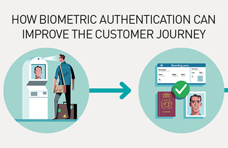
This online infographic for Gemalto’s /review microsite shows the journey from airport check-in to boarding your place, using biometric technology. Simple illustrations reveal each step of the process and how it could allow you to skip the queues.

We’d love to hear from you if you are looking to produce an infographic or you’re wondering which style would work best for your audience. Drop us a line at: hello@wardour.co.uk
Stay ahead of the curve
Sign up to our emails

